|
|
| |
|
 June 18,
2006 Commentary (weekend edition)- June 18,
2006 Commentary (weekend edition)-
Well, that
was another fantastic trading week, in my opinion. And it all happened without
'retail'. I heard some number from one of the main online brokerages, and they
were so pitiful for retail I just couldn't believe it. I know I lament about
this constantly, but I just can't understand why retail leaves in the summer
when trading is really spectacular. It's not like they can afford the a house
in the Hamptons, as I said before. Well, I'm rambling, so let's move on. I'll
just have to accept that some mysteries never do get solved.
The money
flow this week was clear, and obvious. I will cover a little bit of that today,
but I shouldn't have to, it was so blatant. When they rotate or shift, and
money moves, price moves. And when it does, it frequently, in my experience,
moves right off areas I find with my methodology. Recall last week's discussion
on the critical setup forming in the treasuries. If you were watching this
closely, as I feel every trader should have been, you already know how the
intermarket dynamic played out this week.
Let's start with last week's Jim's
Chart of the Week, and after a quick look at the S&P, we'll get to those
rates.
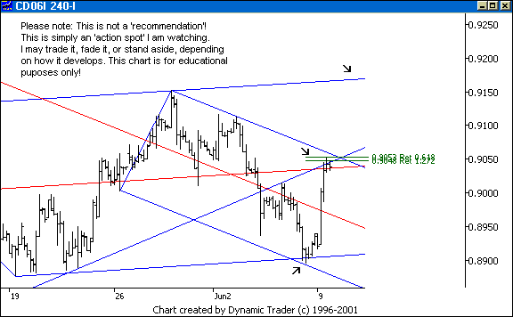
Here's last week's chart of the week. I'm not
sure everyone understands the chart of the week. This is a chart I post on the
weekend, with something I am watching for the upcoming week. You can access the
chart by going to the home page and clicking on 'Jim's Chart of the Week' in
the upper left hand area of the page. The one you see here was posted there
last weekend, and the one I'll likely show next weekend is posted now. All of
these are posted 'in advance'. They are not 'picks' (since we all know I don't
make any recommendations), but simply something interesting I am watching that
I feel has good educational potential if the reader follows along as it
unfolds. With that said, let's get to this chart.
The play for me was on a higher
timeframe, a long setup off the lower arrow area. To assist in my management I
wanted to watch the area in the middle by the second arrow. That's a likely
spot for a rollover, or just a pullback. If it pulls back I want to watch the
structure of the pullback, and how it reacts to various areas as it pulls back.
If the area gets blown out, so much the better for my overall premise. The
upper arrow shows another obvious area, should it get there. I can't point out
every area, or it would be too much, even though I have many areas I watch, in
succession.
Now, what is missing here? What about an area at the upper division
line (not shown)? Are there other lines in there? If you did the work you
already know the answer to that. Let's fast forward to today, and see what
happened.
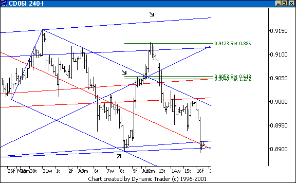
I added one very obvious set on the chart. It
is a bit difficult to discern here, and that is why I have to limit what I put
on a given chart in this commentary. I would also be looking at the upper
division line of the main set, and an upper warning line from that downsloping
set here, but they would clutter this up beyond usefulness. I can do it on my
working charts because they are big charts, on big screens, and I know what I
did. You'll have to do the latter two lines on your own. They didn't hit dead
on the area, but they were close.
The point is, the CD totally ignored the
median line area, barely hesitating at all there. This is another example of
why I don't 'fade' anything, and why the entry trigger is an integral part
of my methodology. The CD went up to the next area, and rolled just about dead
off the .886 retracement, in the area of the three lines (only one of which
I've shown here). It rolled all the way back down to lower parallel area.
Although I felt the odds were pretty good this would exceed the recent high and
at least get to that upper parallel, the price action clearly showed it was out
of gas. When I see a strong roll happen at an area that is fairly obvious, that
'ups' my level of attention paid to the action. Enough said here.
Let's do a
quick follow up on the S&P before we get to those treasuries.
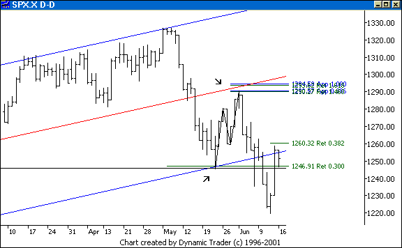
The first arrow was my original long area.
The second arrow shows the recent ABCD setup we have been looking at. The ABCD
continued to play out and set a new low for the move after that wicked bounce
up day. Now it is critically placed. Just about all the indices have ABCD's
they are reacting off of, and just about all are shortened alternate ABCD's.
This one here is an .886 alternate.
Notice the 'test' of the lower parallel here
from below, in the area of a .382? Do the retracement off the C point of this
bigger ABCD and notice one of my other unique Fibonacci-derived numbers right
in here. Is this a big ABCD with a clear ABCD in the BC leg? Just about all the
markets have this. Or is it 'wave 3'? How critical is this? Now, as this
started to bounce, what happened to treasuries, not to mention metals,
currencies, and energy?
Let's look at the 10-year.
Recall this was our main topic of discussion
last week. The 10-year was forming an ABCD, and after a 'test' of the area, it
started to drop right off. I showed the time symmetry area for the ABCD in
there, too. Notice a trendline (not shown) off the A and C points is now
violated. So, out of treasuries and into stocks. Okay, I see.
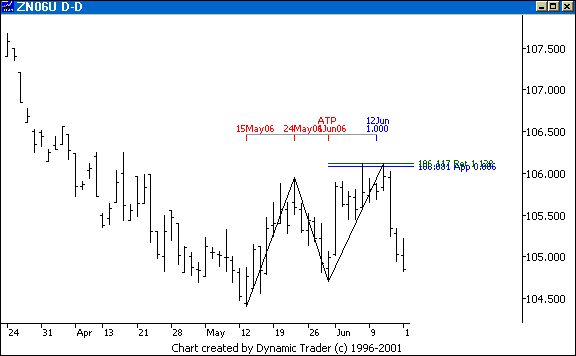
Let's look at
the 30-year.
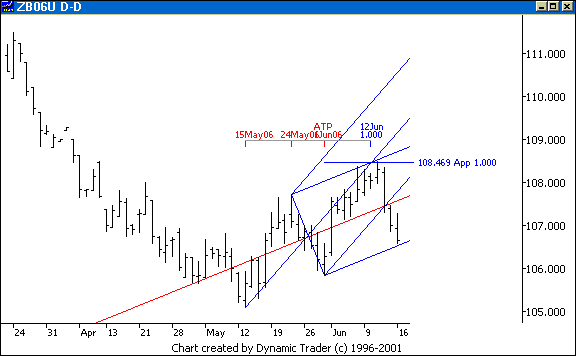
The 30-year ABCD was extra clean and nice
looking. The 1.000 ABCD came together right at a modified Schiff median line
set upper parallel and a standard set median line. I also showed the symmetric
time area for this one. The 30-year came right off the area, and look where it
now sits. To see a bit more of what I am watching here at this extremely
critical juncture in rates, see this week's chart of the week. Hmmm, I just
showed the position of the S&P, and now look at the 30-year. Both hitting
key areas at the same time, after moving off key areas at the same time. Must
be a coincidence.
Let's finish with one of the rate charts from last week. Recall
that this is the rate index for the 10-year, which is, essentially, a flipped
over version of the 10-year chart.
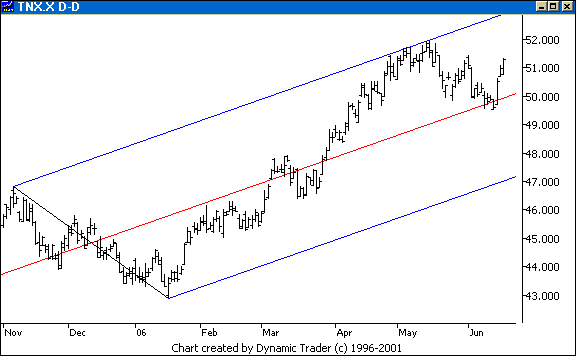
So, rates decided to 'see' that median line
and move off the ABCD right in that area. That wasn't much of a surprise. What
happens next is critical. Go back to the higher timeframe charts of this index
from last week, and see what is looming. As I said, this is as critical of a
time for the economy as I can remember. You know I'll be watching intently, and
you should be, too.
As I close, are you watching that pound that I mentioned
last week? If money is flowing, you'll see it in the currencies and energy. Are
you? I love it when a plan comes together. Lastly, the commercials are still
very, very short the S&P, almost 70,000 contract with the 'mini
equivalents' that are now critical to factor into the calculations. This is
huge, and they are showing no signs whatsoever of thinking this 'bull' will
continue. Just something I want to factor into the mix as I assess if this is a
bullish ABCD here, or a 'wave 3' that might be part of an AB leg in a much
bigger correction. Time will tell, but if those rates blow out that key area
overhead on the higher timeframe rate chart, I know what my opinion on the
S&P is going to be...
The next commentary will be next weekend's edition,
posted by Sunday evening, June 25, 2006.
|
|
|
| |
|
|
 NOTE: Reading this page or
any page on the Kane Trading website, or utilizing this website and any
material NOTE: Reading this page or
any page on the Kane Trading website, or utilizing this website and any
material
contained herein in any way, shall constitute an
acknowledgment that you have read, understood and agreed
to all
the disclaimers,
terms & conditions, and
policies of this site.
|
|
|
This
website is best viewed with MSIE 6.0, text size set to medium, and screen
resolution set to 1024 by 768.
Copyright
© 2006 Kane Trading. All rights reserved.
|
|

