|
|
| |
|
 March 1,
2009 Commentary (monthly edition)- March 1,
2009 Commentary (monthly edition)-
Wow, how
incredible is this market and action? I just can't believe the amount of
movement, the level of government 'involvement', the direction of our world,
and the 'free market'. We all know about that old saying about living in
interesting times, well, we got 'em. I just never thought they'd be quite so
interesting. And the really scary part for me is that I think the ramifications
of all this have barely started to play out. Heck, maybe the stock market
bottom is near, and we start a big new bull soon, but even if that happened,
the economy still has to deal with all this, and I still think that has a long,
long ways to go.
I don't want to go on too much about this whole mess, as I want to
get to work as quickly as possible on the cool chart stuff, but I will say one
more thing. If you are inclined to study this a bit more, dig into Europe,
where I personally think there is a lot more trouble than most think (or let
on), and as I have said for a long time, they are way behind the curve. The
unfolding mess with Eastern Europe now will just escalate the situation. I
can't imagine how the Euro isn't going to fall way lower from here. I'm even
struggling to see the EU holding together when the pressure of all this mounts.
I saw one figure of an additional $25 trillion for European banks. How in the
heck is that going to play out, if true? So, do some research in that area if
you want to pursue this.
I'll cover one quick item of business, and then we'll
get started. I added an article to the Free Articles page. I don't want
to go into too much detail here because I explained it on the article page, and
in the What's New section,
and three times writing the same thing is more than I need to do. So, I suggest
everyone go to the Free Article page, scroll down to the bottom, and check out
the new article. If you are struggling at all with the mental aspects of
trading, this is a great place to start, and gives you a new resource that may
be of some use to you.
I'll start out today with the Chart of the Month, which
we waited on last month, since not much had happened. I will show it today,
even though it isn't fully at the area. Still, it is worth a look, and some
brief discussion.
Here's the 10-year rate chart, on the monthly timeframe.
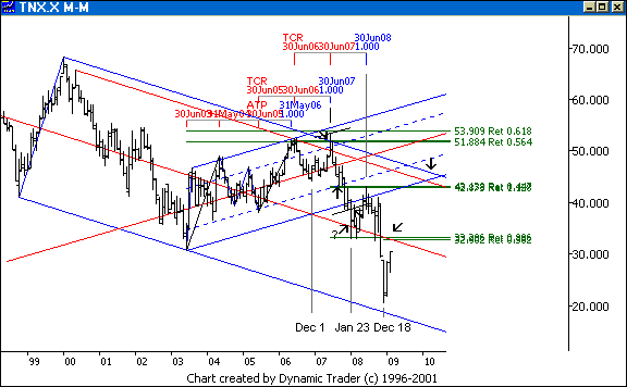
Rates are moving up exactly as I expected,
headed right for that area shown by the arrow. If you do an offset line for how
much the price action 'missed' the lower parallel, and drew another one both
above and below the median line, I am expecting a possible reaction anywhere
from here to about where the arrow point is. Now I drop down to the lower
timeframes and look at the structure there, and what the lines and such tell
me.
If this area doesn't slow the rates down, then I think some serious
things are getting priced in. I'm still watching to see if 'they' get tired of
our treasuries, if the 'bubble' really pops in those, or if inflation starts to
get priced in. How odd, a big deflationary environment, yet a big worry about
'hyper-inflation' at the same time. Given the 'flight to quality' as the stock
market continues to be hammered, and the potential for the Fed to buy
long-dated treasuries, I am not sure how much they can sell them off, but if
they do, I have the areas I will be considering for trading.
I'll start
our next phase here with a quote from last month's commentary: "Let me relate a
story from a short while back, before the market collapsed. I may have
discussed this a bit in a previous commentary, I can't recall. I mentioned to a
really big name that I thought when MER (as well as a few others) was breaking
to new lows as the rest of the market held up that this was an ominous sign. He
didn't agree, and opted for the long side of several brokers. They bounced a
little bit, and then collapsed, leading the market to the bottom. I respected
the sign when a key issue like MER wasn't acting bullish, but instead was
setting a new bear market low. I watch things like this. Now I am seeing
something similar, and getting similar responses from people (which is good
news, in my opinion).
As everyone talks bullish about the market,
the transports are within a hair of a new bear market low. They almost got it a
few days back, then they popped up a little, and are now heading right back
down. Take a look at some key (in my opinion) stocks, in and out of the
Transports. Look at FDX, at a new bear market low. Look at GE, at a new bear
market low. WMT. MSFT. CAT. The rails, by a long ways. The dryshippers (look at
DRYS) are rolling hard and look ready to crater, and look how low they already
are. I won't even mention financials. I could go on, but the point is made.
This is an ominous sign. This is the kind of action one would expect in a new
bull market? This is the kind of action I'd expect right as another leg down
starts. Just something to think about."
So, what did the Transports do, then? Let's
take a look at that same chart I posted last month, updated to today.
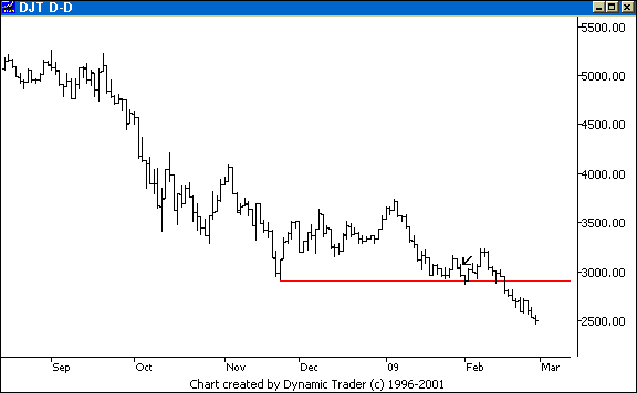
The arrow shows where we left off when I
wrote those comments. Oops, down it goes. It quickly set a nominal new bear
market low, popped up a bit, then flushed. (Bingo, Dow Theory sell signal.)
Students of mine should quickly see something in this chart. Later we'll look
at an analogous situation in the S&P 500. Also take a look at some of the
stocks mentioned, and other 'leaders'. The price action is clear to me, the
outcome no surprise. I'll tell you what is a surprise to me, but
shouldn't be.
Just as I mentioned above with MER, while I'm reading the signs and
clues, many others, the highest number I've ever seen, are still talking
bullish. I know this one trader and he is always the most bullish of anyone I
know. Well, I've been following a blog of another very well-respected trader
(these are not 'daytraders', but short-term traders, sometimes intraday,
sometimes longer), and he's so bullish he makes this other guy look like a
perma-bear.
He keeps saying if it violates this or that low, then I won't be so
bullish, and it does, and next he explains why he is now more bullish than
ever. Then he repeats something similar, it violates it, and the same song and
dance, and he's then even more bullish, and the rally will be even greater. If
you keep that up, eventually you'll be right. Even a stopped clock is
right two times a day. This is what I am seeing across the board, just wall to
wall bulls. Even the biggest bear I've ever seen, a big short fund guy, is now
bullish. Every analyst, every fund, every perma-bear I have seen is now wildly
bullish.
Let me point out two things here. First, when we did the 'retest'
of the 2002 low, the bearish sentiment was much greater than on the actual low.
The 'test' was successful, and the new bull got under way. This was the one
that took us into 2007. On this 'test' the sentiment is much, much more bullish
than at the low we are 'testing' (assuming my information is correct, of
course). This is the opposite of the last bear market bottom, and the opposite
of what I would expect. No, it is no guarantee, but it is a red alert for me.
'Lotsa bulls' is all I see.
Next, instead of capitulating, they are fighting the
trend. The latest thing, which I saw from multiple sources? The Wilshire 5000,
which is, they say, a much better representation of the actual market, is not
at a new bear market low. If this really was still a bear and not a new bull,
they say, the Wilshire would not be 'holding up' above the low. Well, first
off, gimme a break. Trannies well at new lows, INDU at new lows, S&P at new
lows, Russell close, this one below, that one a little above, look at the
trend. The bear doesn't 'restart' when the lows are violated. And if they are
violated, what do they say anyway?
Well, this is the 'test' we have been waiting
for, and a 'test' can go 10%, even 20% below the low, so we are fine. This is
still a new bull. Are these people on crack? As it turns out, if my data is
correct, the Wilshire closed at a new bear market low today, below the November
closing low. No, it hasn't violated the intraday low yet. And I suppose if I
were still listening to these maniacs, that's what they would be saying. Hmmm,
INDU at what did they say, a 12-year low, and they are arguing we are in a bull
market? Uh-huh, pass me the crack pipe when you are done...
Let's move on
to what I am watching. I'll start with a nice 'context' chart for the Dow Jones
Industrials, on the monthly timeframe.
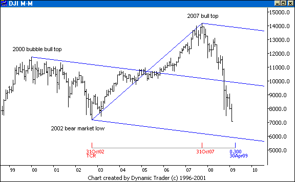
I put this standard median line set on my
monthly chart, using the three most significant points in recent times, the
bubble bull top of 2000, the 2002 bear market low, and the recent 2007 bull
top. That lower line just calls to the market, like a siren song, in my
opinion. Maybe it doesn't ever get there, but it calls... I put a time
retracment on there, not as a time target, but to show just how fast this is
all unfolding. April is only a 30% time retracement of the entire last bull.
Anyone who follows time factors at all will tell you a .382 is a minimum time
retracement, and it usually takes longer.
It is curious that March is coming
up as a time factor for almost everyone I hear out there for a 'big' bottom. I
think all this came from one source, and is now being mentioned by every trader
out there, without knowing why. So, among the short-term traders who aren't
victims of the sirens and their songs, they are all convinced March and up we
go. I will say, though, if we plunge at the current rate, we will get to that
line some time in March, by the looks of it. Just something to keep in
mind.
Let's jump to a weekly chart, and look a little more closely at
this. I had to start with the monthly chart so you'd be able to clearly see and
understand where the lines came from. Let me mention, too, that the same set
can be done with the S&P, using the division line because of the 'double
top', and the Russell, for example.
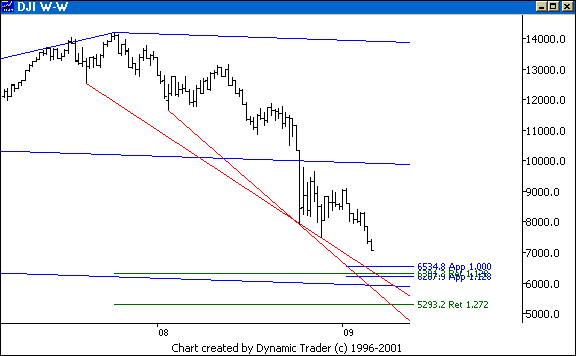
I put just a few simple, basic Fibs on there
that beef up the area. This is not a comprehensive workup, you'll need to do
that on your own, just some key factors to sketch out the area. I have the
1.128 and 1.272 external retracements off the bull run up, and I also did a
comparison of the possible 'wave 1' with this unfolding potential 'wave 5'
(more on this in a moment). I also threw on two lines that really guide the
eye, and perhaps the price action, into the area. Although these are
stand-alone lines for me, they also duplicate set lines I had on my working
charts from way back. The area is quite clear. The main range is in the
5,800-6,300 area, or possibly a stab down to 5,300.
Recall way
back I said I was watching 6,300 and 5,300? Now you can see where those numbers
came from. I also mentioned if they really kill this thing 2,800. That's the
1.618 (not shown) off the entire bear. If that can't hold, take a look at where
the entire secular bull started. That's around 1,000. If that happens, we'll
all be selling cigarettes on the street corner, so let's not worry about that
for now. Lastly, is this too broad of an area? For me, not at all. First off,
it's based on a monthly chart. Next, this just shows the general area, then I
drop lower and do work there to refine it. Detailed weekly and daily work, and
even below when the time gets close. Then price action dictates from
there.
Let's look at this from an Elliott perspective. I'll add my count
onto the chart.
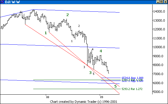
Understand, as I have said so many time
before, I use from Elliott only the practical things that I feel help me. I am
far from a strict practitioner. In that light, here is my count. It's pretty
obvious, pretty clean, and pretty classic. It's also pretty obvious to everyone
on the planet. It also happens to fit in very nicely with the framework I have,
which is independent of any counts. Just another thing to throw into the mix.
So, my 'bias' is short side until it actually starts going up, or it hits the
area and shows me something, then, as I did on all three peaks going into the
actual bull top in 2007, I'll look for setups for the 'big' potential reversal.
If it rolls over, that's fine, maybe it wants that 2,800, or whatever, then
I'll just see what it is doing and flow with that.
Let me make
it clear, I am not saying this will end the bear market if this area is hit and
it starts up. It may end the cyclical bear, or it may be just a bear
market rally. If it is a cyclical bull, that bull may be a big ABCD pattern, which might be a BC
leg of a bigger ABCD, and then a new cyclical bear (which may not set a new
low, but just 'test' the low we may put in here), and that may then end the
secular bear trend. On average, as I have said, this secular trend would end in
2017.
Still, given how fast this bear has unfolded, those cycles I just
mentioned would likely unfold before 2017, so I wonder if enough time has
passed for a bull to start soon. Maybe a bear rally, down a lot more, a lot of
basing, then what I said. Who knows. I sure don't, and I don't need to. But
looking at scenarios and places I will be looking for things to set up is
something I find helpful, so I do it. I also probably get more positive
comments for showing that than anything else I do, I think.
Let's move on
to the last 'swing' setup that got us to where we are now. Here's a 130-minute
chart of the S&P.
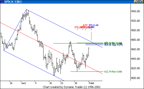
This is the 'analogous' setup that I
mentioned when we were looking at the Trannies. I would have shown this in the
ES, but I am having issues getting data in for these charts, so the S&P
index will have to do. I discussed this setup in the forum, in detail, in
advance. We even wound up creating an entire topic for it. You might say, well,
if you showed a hundred setups and picked the one that worked to show now,
well, that isn't saying much. If I recall correctly, this was the only swing
setup in any of the indices I discussed in advance in the forum since the last
commentary.
The point of the forum is for students to discuss the methodology
with each other. I post here and there (more than I really have time for), but
I am not leading the forum, posting all the time and 'teaching' in there. I
simply don't have the time for that. And it isn't my goal to show a lot of in
advance stuff to my existing students. They all have the books, I don't need to
'sell' them anything. So, I may mention things here and there, but mostly I
answer questions, and post charts explaining various aspects of the work so
that it can be understood.
No one in there needs me to try to 'prove' anything,
this is a group of people that have already decided they want to study this
material, and I am in there trying to help them. Instead, I encourage them to
post, in advance if they want, which many do, or after-the-fact, and we can all
discuss the setups, the management, whatever. My point is, this is a setup I
discussed in advance, and wasn't one of many that I just happen to get 'lucky'
on. I'm not claiming every setup is like this, but I do want it to be clear
this isn't one cherry-picked setup, either.
So, with all
that rambling out of the way, let's look at this. The main aspect on this for
me was the key set line I had been watching for quite awhile. I had at least
two patterns converging here, and a slew of key Fibs coming in tightly
together. As I usually say, there are some other things here, too, but this is
more than enough to show what the setup was. I also had a time symmetry factor
for that smaller ABCD going into the area. Notice that .886 retracement, too,
that sent this up. How nice is that? This is a quintessential Kane Trading
setup here.
Let's move ahead a bit and see what happened.
The S&P went right to the area, and
'tested' it multiple times. Go to a 15-minute, or a 5-minute chart and look at
the action. You can kind of see it here if you look closely, as three bars kept
touching right on or near the line, and then they let it go. Notice the level
of that .886 and the median line, too. That would surely be an area I would
want to be cautious about. It's way outside the scope of this commentary, but
there are specific reasons I would be watching in that area, and specific
things I'd want to see, in order for me to apply my management as I explain in
Kane Trading on: Trade
Management, to stay with this to the area I'd expect it to work towards
if it was to 'play out', and that would be to that lower parallel.
Let's see
where this went from here. I'll add a few things onto the chart, and then
explain them. Chart number eight, folks, it's bonus month.
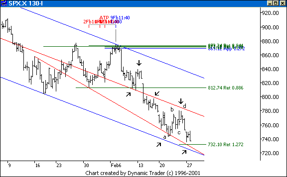
The arrows show how the price action liked
this set. Notice the first reaction at the area I mentioned above. The rollover
was at a 'most probable' area, at that second arrow. What was there? Add on
division lines for this set (not shown, for clarity). You can see by eye the
division line is right in there. The S&P heads right to that lower
parallel, also tracking that line in red. Sure, that line is easy to see
after-the-fact, but that's not a line I drew in after-the-fact to show you,
it's a set line I had from almost a month and a half ago, and I just showed the
one line here.
As I have said, I tend to leave things on, as I see price action go
back to them many times. And what about on the lower timeframe? Just look at
that nice little ABCD there from the second and third last arrows. If you
offset the lower parallel and the median line by the same amount, as I
mentioned with the 10-year rate chart, you can see how the set frequency fit
just about perfect with that little ABCD. It doesn't get too much better for me
than that. Of course, there were other things, Fibs, set lines, and so on, on
the lower timeframe, that supported that area, too. Now we can see that the
S&P is right on the 1.272 area off that ABCD, right back to those lines. Is
it due for a bounce in here? I'll say so, but if it doesn't, it may collapse,
perhaps right to that bigger area.
It makes no difference to me from a trading
standpoint what it chooses to do, as long as it keeps giving areas I can create
setups off of. That's all that matters to me. Bull, bear, up, down, collapse,
oversold, overbought, chopping around, bear rally, I don't care. I only care
about setups. All day long, every day, every week, from intraday tick charts
and e-mini's to monthly charts on commodities, indices, currencies, whatever,
the procedure is the same. Just keep doing the setups, following the 'Trading
Plan', same old, same old.
I hope everyone enjoyed today's commentary, I thought it
came together quite nicely. I'm so perfectionistic, I am rarely happy with
anything I do. Instead of looking at the positive side of what I showed, for
example, I tend to think about all I wanted to show, but didn't have room or
time for. Today I tried to choose things that conveyed concepts I thought were
worth seeing, but also ones where I could cover all of what I wanted to cover,
and I think I came close. It's all about choosing the topics wisely, and not
trying to do too much. I like to think I am helping people out in their quest
to find their way, their own style and method. If I didn't think I was doing
that, I would have a lot of trouble getting motivated to do this commentary.
So, right now, I'm feeling pretty good.
The next commentary will be next month's
edition, posted by Sunday evening, April 5, 2009.
|
|
|
| |
|
|
 NOTE: Reading this page or
any page on the Kane Trading website, or utilizing this website and any
material NOTE: Reading this page or
any page on the Kane Trading website, or utilizing this website and any
material
contained herein in any way, shall constitute an
acknowledgment that you have read, understood and agreed
to all
the disclaimers,
terms & conditions, and
policies of this site.
|
|
|
This
website is best viewed with MSIE 6.0, text size set to medium, and screen
resolution set to 1024 by 768.
Copyright
© 2009 Kane Trading. All rights reserved.
|
|

